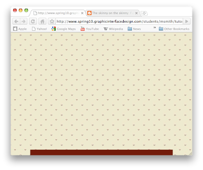
This tutorial is the child of having to figure out full browser Flash and having an object bottom align to the center of the stage. One advantage of having a Flash page run full browser is being able to scale the page with the background and everything. While it is possible to do the same with HTML, by building a full page .swf you can have a navigation menu that locks to the bottom of the page and moves with the page scale.
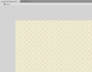
First, you need to create a new Flash AS3 document. For this one, I created just a simple 600 x 800 stage, and have just a single frame. For the background, I created an empty box larger than the stage itself (and far larger than the computer screen for that matter). Then, instead of filling the box with a solid color, you can load the box with a
n image. I created a simple pattern (37 x 37 pixels) for this tutorial. Flash will take the image and tile it to fill the entire box.

Once the stage is filled with the pattern, you just add the code to keep the background locked in place (top left aligned) so that when you scale the page the image doesn't move. This is where the magic happens. It's rather simple, but has to be done correctly for this to work. If you don't, the page scaling won't work.
Create a new layer, name it actions, and go ahead and give it the good old lock. Open the actions window and add the code, which looks something like this:
This code calls in a few different things. First, we import some important things that allow us to resize the window. This all takes place in the first 6 lines of code. With these six lines, we can scale the browser window to any size and the background image will expand with the browser. Because we set to align to the top left in line 6, it stays in position and doesn't move.
The rest of the code makes is possible to lock an object to the bottom center of the .swf (or browser window if you prefer to think of it that way). The variables in lines 14 and 15 gather the width and height of the stage and input the data into the following couple of lines. There are other ways to move and align objects around the stage using this code, it just requires playing around with some numbers and such. That's about all it takes!
Click here to see this tutorial in action!
